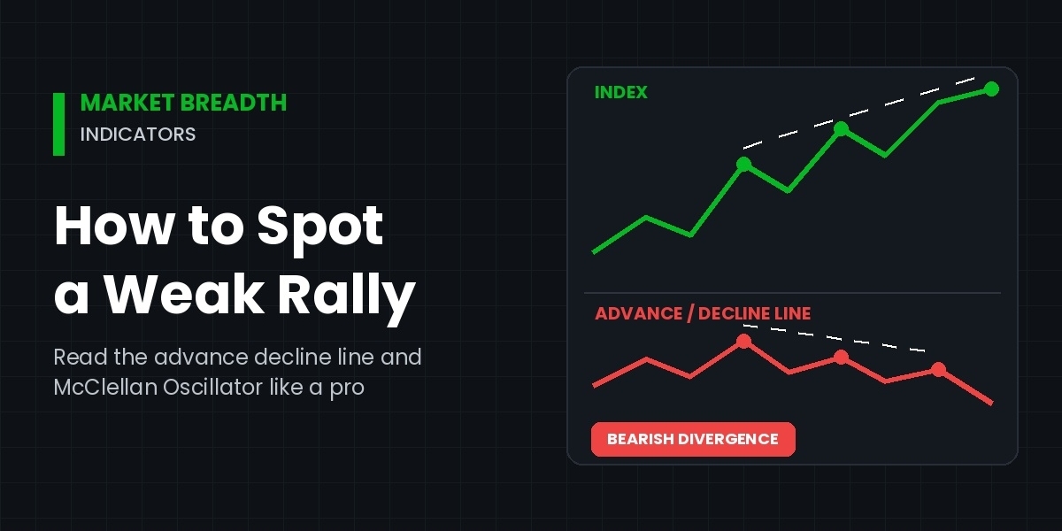

Not every rally deserves your trust. Over the years, I have watched major indexes climb to fresh highs while most stocks quietly slipped lower underneath. On the surface, everything looked healthy. In reality, only a handful of large companies were carrying the entire market.
This gap between price and participation is exactly what market breadth indicators are designed to catch. Instead of asking how far an index moved, they ask how many stocks joined the move. As a result, they often flag trouble weeks before the headline index finally rolls over.
In this guide, you will learn how breadth works and how to read the advance decline line and the McClellan Oscillator. You will also learn how to combine them into a simple, repeatable process. Most importantly, you will see how to spot a weak rally before it catches you off guard.
What Are Market Breadth Indicators?
Market breadth indicators measure how many stocks are participating in a market move. In other words, they track the internal health of an index rather than its price alone.
Most major indexes are weighted by market capitalization. Consequently, a few giant companies can push the whole index higher even when the average stock is falling. Breadth data removes that distortion because every stock gets an equal vote.
The raw inputs are simple. Each day, exchanges report how many stocks advanced, declined or stayed unchanged. They also report new 52-week highs, new lows and the volume flowing into rising and falling shares. From these numbers, analysts build the breadth tools covered below.
Think of it like an army. A general marching forward alone is not an advance. However, when thousands of soldiers move with him, ground is genuinely being taken. Breadth simply tells you whether the troops are following.
How the Advance Decline Line Exposes a Weak Rally
Among all market breadth indicators, the advance decline line is the oldest and most widely followed. It is also the easiest to understand.
How It Is Calculated
Each day, the number of declining stocks is subtracted from the number of advancing stocks. That daily figure, called net advances, is then added to a running total. For example, if 1,800 stocks rise and 1,200 fall, net advances equal 600. The line therefore moves up by 600. Over time, this cumulative total forms a line you can chart beneath any index.
Keep in mind that NYSE data includes many bond funds and preferred shares. For this reason, some analysts prefer a common-stocks-only version for a cleaner read.
Reading the Signals
When the index and the advance decline line rise together, the rally has broad support. That is the healthy scenario. Problems begin when the two lines disagree.
The classic warning is a bearish divergence. Here, the index makes a new high, but the advance decline line fails to confirm it. Instead, it prints a lower high. This tells you fewer stocks are lifting the market each time it pushes higher. In my experience, this pattern deserves close attention, especially when it persists for several weeks.
History offers clear examples. The NYSE advance decline line peaked in 1998, long before the 2000 technology top. Similarly, it topped months ahead of the index in 2007. In both cases, the headline index looked strong while participation was already fading.
Practical Tips
- Compare the line with the index it represents, such as NYSE breadth with NYSE-heavy benchmarks.
- Focus on swing highs rather than daily wiggles.
- Give more weight to divergences that last weeks, not days.
Using the McClellan Oscillator to Measure Breadth Momentum
While the advance decline line shows the trend of participation, the McClellan Oscillator shows its momentum. Sherman and Marian McClellan developed it in 1969, and it remains a staple for market technicians.
How It Works
The oscillator starts with daily net advances. Next, two exponential moving averages are applied: a 19-day average and a 39-day average. The oscillator is simply the 19-day value minus the 39-day value. As a result, it swings above and below a zero line.
Many analysts also use a ratio-adjusted version, which divides net advances by total issues traded. This adjustment keeps readings comparable as the number of listed stocks changes over the years.
Key Readings
- Above zero: breadth momentum is positive.
- Below zero: more stocks are losing momentum than gaining it.
- Extremes: readings near +100 or -100 on the classic version often signal overbought or oversold conditions.
Spotting Weakness
A weak rally often shows up as a falling oscillator while prices keep climbing. For instance, the index may grind to a new high while the McClellan Oscillator prints a lower peak. That lower peak warns that buying pressure is fading beneath the surface.
Another useful clue is a failure to reach positive extremes. Strong, durable rallies usually begin with a powerful breadth thrust. So when a bounce cannot push the oscillator meaningfully above zero, the buying is probably thin.
Finally, the McClellan Summation Index adds up the daily oscillator values. It acts as a longer-term trend gauge. If it rolls over during a rising market, the broader picture is quietly weakening.
Other Breadth Tools Worth Watching
The advance decline line and the McClellan Oscillator are excellent starting points. Even so, a few other market breadth indicators can confirm what they suggest.
Percentage of stocks above moving averages. This tracks how many stocks trade above their 50-day or 200-day average. If the index climbs while this percentage falls, fewer stocks are in uptrends. That is a textbook sign of narrowing leadership.
New highs versus new lows. In a healthy bull market, new 52-week highs should expand as the index rises. By contrast, a rally with shrinking new highs, or rising new lows, is suspicious.
Up volume versus down volume. Simple counts treat every stock equally, whereas volume adds conviction. When most volume flows into declining stocks during an index rally, larger players may be quietly selling.
Equal-weight versus cap-weight indexes. Comparing an equal-weighted index with its cap-weighted version shows whether the average stock is keeping pace. A persistent gap in favor of the cap-weighted index means a few giants are doing the heavy lifting.
A Step-by-Step Process to Spot a Weak Rally
Market breadth indicators are only useful when you apply them with discipline. Over the years, I have refined a simple routine. It works on daily charts and takes only a few minutes.
- Confirm the price trend first. Make sure the index is genuinely rallying. Then mark recent swing highs so you have clear reference points.
- Check the advance decline line. Is it making new highs alongside the index? If it lags or makes lower highs, note the divergence.
- Review the McClellan Oscillator. Look for lower peaks during the rally. Also check whether it reached strong positive levels when the move began.
- Study participation. Check the percentage of stocks above their 50-day and 200-day averages. Falling readings during a rising index confirm narrowing breadth.
- Compare new highs and new lows. Expanding new lows during an advance is a serious red flag.
- Look for agreement. One weak signal is a caution. However, three or more pointing the same way deserve real respect.
- Adjust risk instead of predicting tops. A weak rally can keep running for weeks. Therefore, use breadth to tighten stops, trim position size or avoid chasing, not to short blindly.
Consider a typical scenario. The index climbs 6% over two months and sets a new high. Meanwhile, the advance decline line peaked a month earlier and is drifting lower. The McClellan Oscillator prints two lower peaks, and only 45% of stocks sit above their 50-day average.
Taken together, these signals describe a rally built on a narrow base. That does not guarantee a decline. Still, it clearly argues for caution and tighter risk control.
Common Mistakes and Limitations
Market breadth indicators are powerful, but they are not perfect. Avoiding a few common errors will make your readings far more reliable.
Acting on divergences too early. Divergences can last for months. For example, leadership was very narrow through much of 2023, when a small group of mega-cap tech stocks drove the gains. Yet the major indexes kept rising for long stretches. Breadth signals are warnings, not precise timing tools.
Ignoring market context. Breadth behaves differently across bear markets, rate cycles and sector rotations. A rally led only by defensive sectors, for instance, may look broad but still lack conviction.
Mixing data sources. NYSE, Nasdaq and S&P 500 breadth can tell different stories. Consequently, always match the breadth data to the index you are studying.
Using breadth in isolation. Breadth works best alongside price structure, volume and trend analysis. Relying on one indicator invites false signals.
Overall, treat breadth as a second opinion. It tells you whether the crowd actually agrees with the price.
Final Thoughts
A rising index does not always mean a healthy market. Market breadth indicators reveal what price alone hides: how many stocks are truly taking part. By pairing the advance decline line with the McClellan Oscillator, you can recognize a weak rally early. Then, by confirming with participation and new-high data, you can act with far more confidence. Ultimately, the goal is not to call every top. Instead, it is to manage risk with clearer eyes.
Many traders who study breadth also pair it with chart-based signal tools. If you have come across GainzAlgo and found yourself asking "is gainzalgo legit," the sensible approach is the same one used throughout this guide. Test any tool against independent data, compare its signals with breadth readings, and judge it on evidence gathered over time rather than on claims.