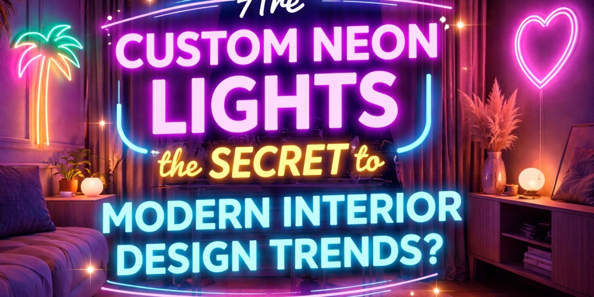

When designing a personalised sign, the font you choose can make a bigger difference than you might expect. The same words can look elegant, playful, modern or bold simply by changing the lettering style. This is especially important when creating Custom Neon Lights, where the font affects not only the appearance of the sign but also how clearly the message can be read.
Whether you want a name sign for your bedroom, an eye-catching feature for a café, a wedding backdrop or a branded display for your business, the right font helps bring your idea to life. However, not every font works equally well with illuminated lettering. Some styles look beautiful on a computer screen but become difficult to read when converted into a physical neon sign.
Before ordering your design, consider the message, installation space, viewing distance and overall style you want to achieve. These simple decisions can help you choose lettering that looks attractive and works well in everyday use.
1. Start With the Purpose of Your Neon Sign
Before exploring different fonts, think about why you want the sign. Its purpose will influence the lettering style, size and overall design.
For example, a personalised sign for a bedroom or living room may look best with soft, flowing letters. A sign for a shop or café may need bold lettering that people can recognise quickly. Wedding decorations often suit romantic script fonts, while office signage usually benefits from clean, professional typography.
Consider these common uses:
Home decoration: Choose lettering that matches your room's personality and existing décor.
Cafés and restaurants: Use readable fonts that complement the business name or interior theme.
Weddings and celebrations: Consider elegant script fonts for names, initials or short romantic phrases.
Retail stores: Select lettering that makes the business name or promotional message easy to notice.
Offices and studios: Choose simple, modern fonts that support your brand identity.
When the purpose is clear, it becomes easier to narrow down the font options and avoid designs that look attractive but do not suit the setting.
2. Choose Between Script, Sans-Serif and Bold Fonts
Fonts generally fall into different visual styles, and each creates a different impression. Understanding these styles is a useful starting point when designing Custom Neon Lights.
Script fonts for a personal touch
Script fonts resemble handwritten lettering. Their flowing curves make them popular for names, wedding signs, bedroom decorations and short inspirational phrases.
They can create a warm, romantic or relaxed appearance. However, very elaborate scripts may be difficult to read, particularly when letters are closely connected or the sign is viewed from a distance.
Choose a script font with clear letter shapes and enough space between words. If your message contains several words, check that the complete phrase remains easy to understand.
Sans-serif fonts for a modern look
Sans-serif fonts have clean letter shapes without the small finishing strokes found in serif typography. They are often suitable for contemporary interiors, offices, retail displays and business signage.
These fonts can make a sign look neat and straightforward. Their simple structure may also be easier to adapt to LED neon-style tubing, depending on the design and the manufacturer's capabilities.
If you want your sign to communicate a name, brand or short message clearly, a clean sans-serif font is worth considering.
Bold fonts for visibility
Bold fonts use thicker letterforms and can help a sign stand out in a busy environment. They may work well for shop names, gaming rooms, event displays and feature walls.
However, extremely heavy lettering can make a design look crowded when the sign is small. Check that the letters have enough open space and that the overall design does not become difficult to read when illuminated.
The best font is the one that balances visual impact with practical readability.
3. Make Readability a Priority
A font may look attractive in a design preview but become confusing once the sign is installed. This is particularly common with decorative scripts, narrow lettering and fonts with unusual shapes.
Readability matters even more when people will view the sign from across a room, from a shop entrance or while walking past your business.
Before finalising your design, ask yourself:
Can someone understand the words at a glance?
Are similar-looking letters easy to distinguish?
Is there enough space between letters and words?
Will the lettering remain clear when illuminated?
Can the message be read from the intended viewing distance?
For example, a long handwritten phrase may look lovely above a bed, where people can see it from nearby. The same font may be less suitable for a café sign that customers need to recognise from the entrance.
If the message is important for business visibility, choose a font that people can read quickly rather than one that requires extra effort to understand.
4. Consider the Length of Your Message
The number of words in your sign can affect which font will work best. A single name or short phrase gives you more freedom to use decorative lettering. A longer message requires careful planning to prevent the design from becoming too wide, crowded or difficult to read.
For example, a short phrase such as “Good Vibes” may work well in a flowing script font. A longer quotation may need simpler lettering or a layout with two lines.
When designing Custom Neon Lights, remember that every additional word takes up space. If the available wall area is limited, you may need to reduce the font size, adjust the layout or shorten the message.
Try to keep the wording concise. A short, meaningful phrase can often create a stronger visual effect than a long sentence filled with decorative lettering.
5. Match the Font to the Size of the Sign
Font selection should always be considered alongside the dimensions of the finished sign. Lettering that works well on a large wall display may not be suitable for a compact design.
Small signs generally benefit from simple fonts with clear shapes. Very thin strokes, tiny decorative details and tightly connected letters can become difficult to reproduce at a smaller scale.
Larger signs allow more flexibility, but the design still needs to maintain balanced proportions. Oversized letters can dominate the wall, while lettering that is too small may lose its impact.
Before ordering, measure the installation area and share the dimensions with your sign maker. Ask for a design preview showing the proposed lettering at the intended size. This makes it easier to judge whether the font will look balanced once installed.
6. Check Whether the Font Can Be Reproduced in Neon
Not every digital font translates easily into a physical illuminated sign. Traditional glass neon and LED neon-style signs have different construction requirements, and the available design options depend on the materials and production method.
Very thin strokes, tiny loops, sharp corners and complicated letter connections may require adjustments during production. A font that looks perfect on a screen might need to be simplified to achieve a clean result.
For this reason, consult the manufacturer before finalising an elaborate design. Ask whether the selected font can be reproduced at your preferred size and whether any letters need to be modified.
A good sign maker can explain which parts of the design may require changes. Making small adjustments early can help preserve the overall appearance while producing a sign that is practical to manufacture.
7. Use Colour to Complement Your Font
Colour and typography work together to create the overall appearance of a sign. Even a simple font can look distinctive when paired with a suitable colour, while a complicated font may become visually overwhelming if the design contains too many competing elements.
For a calm bedroom or living room, softer shades may suit the surrounding décor. Bright colours can create a more energetic look for entertainment spaces, cafés or retail displays. White and other neutral-looking illuminated effects can complement minimalist interiors, depending on the sign's construction and lighting conditions.
When choosing colours for Neon Lights, consider the wall behind the sign, nearby furniture and the amount of ambient light in the room.
Keep the design focused. One main colour, or a carefully chosen combination, is often enough to create a clear visual identity. If your sign includes a business logo, use colours that are consistent with your existing branding.
8. Think About Your Brand or Interior Style
The font should feel connected to the place where the sign will be displayed. A mismatch between lettering and surroundings can make even a well-made sign look out of place.
For a modern office, clean lettering may complement glass, metal and simple furniture. A café with a relaxed atmosphere may suit a friendly script font. A beauty studio might use elegant, minimal typography, while a gaming room could benefit from bold, geometric lettering.
If the sign represents your business, consistency is especially important. Try to match the typography to your logo, website and other marketing materials. Using a similar style across different platforms can help customers recognise your brand.
For home decoration, consider the mood you want to create. The font should complement your furniture and wall design rather than compete with them.
9. Review the Design Before Placing Your Order
Once you have shortlisted a font, review the complete sign design before approving production. A preview can help you spot spacing problems, awkward letter connections or proportions that do not look right.
Check the following details:
The spelling and capitalisation of the message.
The font style and letter thickness.
The total width and height of the sign.
The spacing between letters and words.
The selected colour and background.
The mounting method and cable position.
The visibility of the sign from the intended viewing distance.
If possible, ask for a digital mock-up showing the sign in the room or on the wall where it will be installed. This can provide a more realistic idea of how the lettering will fit the space.
Take your time during this stage. Correcting a design before production is generally easier than requesting changes after the sign has been made.
10. Work With a Reliable Custom Neon Sign Maker
A dependable manufacturer can help you choose a font that balances appearance, readability and production requirements. When comparing suppliers, look at the quality of their previous work, the clarity of their design process and the information they provide before taking an order.
Ask whether they offer font recommendations, design previews and adjustments before production. Confirm the final dimensions, materials, mounting options, warranty and installation instructions.
It is also worth checking how the sign will be packaged and delivered, particularly if it is large or intended for an event. Clear communication helps reduce misunderstandings and makes the ordering process more straightforward.
Avoid choosing a supplier on price alone. A well-planned design, suitable materials and clear after-sales support can be more valuable than a low initial quote with limited information.
Conclusion
Choosing the right font for Custom Neon Lights involves more than selecting lettering that looks attractive on a screen. You need to consider the purpose of the sign, the length of the message, the available wall space, the viewing distance and whether the design can be reproduced effectively.
Script fonts can create a personal or romantic look, sans-serif fonts offer a clean and modern appearance, and bold lettering can help important messages stand out. Whichever style you choose, make readability and practical design part of the decision.
Before ordering your Neon Lights, review the dimensions, colour, spacing and production requirements with your sign maker. A clear design preview can help you make adjustments before production begins.
With the right combination of font, size and colour, you can create a personalised sign that suits your space, reflects your style and communicates your message clearly.